Twitter font: Chirp, its alphabets and the Unicode look-alikes
The Twitter font is Chirp, X's own typeface since 2021. It covers Latin, Cyrillic and Greek, and no setting on X swaps it out.

A wrong guess about the Twitter font shows up in two places. A mockup set in Helvetica looks slightly off beside the real feed, and a post pasted from a font generator reaches screen-reader users as a string of symbol names.
Short answer: the Twitter font is Chirp. Twitter commissioned it from the Swiss foundry Grilli Type, and X's website and apps have displayed it since August 2021. The catch: nothing in X's settings lets you pick a different typeface, and the "Twitter fonts" from online generators are Unicode symbols, not fonts, which screen readers announce one symbol at a time.
Below: where Chirp came from, which alphabets it covers, who may use it, and what to do instead of fake fonts.
Chirp, the typeface X has used since 2021
Chirp is X's own typeface, used for posts, display names, handles and the interface around them. It predates the 2023 rename, and X kept it, so the font on your screen today is the one Twitter launched.
Chirp made its debut in January 2021, in the brand redesign announcement where Twitter called it "our first-ever proprietary typeface."
Grilli Type, a Swiss foundry, developed it with Twitter. The post describes American Gothic and European Grotesque styles blended together, then roughened with handmade quirks from early woodcut specimens.
Among the announcement's sample cards was Twitter's own post "what is time," set at headline size in the new face.

The app itself switched over in August 2021. TechCrunch reported Chirp arriving on the website, in the iOS and Android apps and on mobile web, together with higher-contrast colors and left-aligned text for Western languages.
Why Twitter swapped system fonts for Chirp
Twitter wanted one face that could carry jokes and news alike. Its announcement said Chirp "strikes the balance between messy and sharp to amplify the fun and irreverence of a Tweet, but can also carry the weight of seriousness when needed."
TechCrunch described the aim in plainer terms: a typeface sharp and legible enough for everyday reading, with room for more personality than the system fonts it replaced.
The rollout drew complaints within days. TechCrunch reported that some users found the new look hard on the eyes, with much of the strain blamed on the stronger contrast that arrived with it. Twitter's accessibility account then announced contrast changes to make the buttons easier on the eyes.
The fix Twitter announced was for the buttons; the typeface stayed.
Which alphabets does the Twitter font cover?
On the web, the Twitter font covers Latin, Cyrillic, Greek and Vietnamese, plus a small set of symbols such as arrows and fractions.
Launch-day Chirp was narrower: Twitter's announcement said it was still "in the process of extending Chirp to languages beyond the Latin alphabet."
I went through the stylesheet x.com loads today to check. It defines 35 font files under one family name, TwitterChirp: five weights, from Light through Regular, Medium and Bold to Heavy, each split into seven character sets.
Each file declares the range of characters it covers, and the browser loads only the files a page actually uses.
All 35 files are upright. The stylesheet loads no italic Chirp, so slanted text on the web is drawn by the browser from the upright letters.
The symbol set holds one surprise.
It includes the circled digits ① to ⑨, so those appear in Chirp, but not the circled letters that generator sites offer, so a circled word never does.
The apps bundle their fonts inside the app itself, so the website is the one version of X where this list can be read directly.
What X shows for Hindi, Japanese and other scripts
Characters outside Chirp's sets come from a fallback list in the same stylesheet: the Apple system font, then Segoe UI, Roboto, Helvetica and Arial, then a row of emoji fonts. Letters none of those contain, such as Devanagari, Chinese or Japanese, are filled in by the operating system's own fonts.
That is why a post in Hindi looks different on an iPhone than on a Windows laptop, while the same post in English looks nearly identical on both.
Can you switch X to a different font?
No. X offers no typeface picker anywhere, and it had none at launch either: TechCrunch noted at the time that users couldn't change the font.
What X does offer sits under Display, which its help center presents as the way to customize your view: font size, text color and background.
Resizing scales Chirp up or down. It never trades it for a different face, on the web or in the apps.
Readers who find Chirp itself hard to read can switch on the high contrast mode that X's accessibility features list for the web and the iPhone app.
On a computer, browser zoom on x.com enlarges everything at once, text and images alike.
Bold and italics on X without changing the typeface
Bold and italics are the only styling X builds into posts, and both are paid features. X's help page About X Premium puts text formatting in the Basic tier, the entry level below Premium and Premium+.
In longer posts, which run up to 25,000 characters, subscribers can add bold and italics. The same page says everyone can read longer posts while only subscribers can create them, so the formatting reaches every reader.
Articles, X's long-form format for Premium and Premium+ subscribers, go further, with headings, subheadings, bold, italics, strikethrough, indentation and numbered or bulleted lists.
Everything in those menus still renders in Chirp.
The bold weight comes from the same family, and the words remain ordinary text, which is the main difference from the generator tricks below.
App updates have moved the formatting controls more than once, so find them in your own composer before a post depends on them.
Why Twitter font generators don't change the font
A generator site doesn't install anything on X. What it hands back is a string of look-alike characters, one per letter, and X displays them as it would any other text.
Behind most bold, italic, script, Fraktur and double-struck looks sits a single Unicode block, Mathematical Alphanumeric Symbols; circled, squared and fullwidth letters are taken from other symbol blocks.
Unicode never meant the math block for prose. The Unicode Standard is clear on this point: the block's characters "are intended for use only in mathematical or technical notation, and not in nontechnical text."
Unicode's character data records each one as a font variant of an ordinary letter.
None of Chirp's character sets in X's stylesheet reaches these symbols.
So the Twitter font never draws those styled letters.
Whatever font your device has for them fills in, which is why one styled post can take a different shape on each screen.
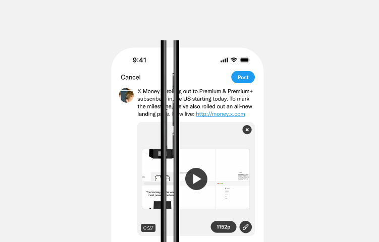
X does it too: the post announcing X Money spells the brand with 𝕏, the character MATHEMATICAL DOUBLE-STRUCK CAPITAL X, and X's own business guide pictures the post composer with a draft that opens with the same symbol.
Do fancy fonts hurt accessibility on X?
Yes. X's accessibility advice for authors asks people to "Avoid special characters." The same list covers what to do instead:
- Write in sentence case instead of all caps or all lowercase.
- Break up large blocks of text with line breaks.
- Write hashtags in camel case, such as #ThisIsCamelCase.
- Put emoji at the end of a sentence, and don't repeat one more than two or three times.
Texas Tech University's accessibility guide spells out the result with a tailgate invitation written in Fraktur letters. A screen reader announces it as "mathematical fraktur small t, mathematical bold fraktur small a" and so on, symbol by symbol, until the sentence is lost.
Two more problems come from the same cause. To anything that matches exact text, a styled keyword and the plain word share no characters, so the styled one can be passed over.
A device with no font for those symbols shows empty boxes or question marks where the letters should be.
The fix is small: keep the words people must read, search or tap in plain letters, and let formatting or one styled word carry the emphasis.
Can you use X's Chirp font in your own designs?
Not from any source X provides. Twitter called Chirp proprietary, and X's brand toolkit, which covers the X logo and how to display it, doesn't include the typeface. Copies on free-font sites don't come from X.
If you've seen TwitterChirp offered as a download, that name comes from X's web code, not from any release by X, and the face is the same proprietary one.
For mockups and brand graphics, use a sans-serif you already own or can buy.
Grilli Type, which developed Chirp, sells a retail family called GT America and describes it as a bridge between American Gothic and European grotesque typefaces, the same blend Twitter named for Chirp.
When a slide or document needs a post to look exactly as it does on X, a screenshot of the real post keeps Chirp without anyone installing it, and it can't drift from what X shows.
Five Twitter font checks for your next post or graphic
Run through these before an X post or brand graphic goes out:
- Mock up X screens with a sans-serif you own, not a Chirp copy from a free-font site.
- Change text size in X's Display settings, since no typeface option exists.
- Use Premium bold or italics for emphasis if you subscribe.
- Style a word or two with Unicode symbols at most, and keep names, hashtags and links plain.
- Read styled posts back with your phone's screen reader before you publish.
Twitter font questions on text size, character counts and Helvetica
Can I make the text bigger on X?
Yes. On x.com, open Display from the More menu and move the font size control.
In the iPhone app, go to Settings and privacy, then Accessibility, display, and languages, then Display (labelled Display and sound in older versions of the app), and drag the font slider.
On Android, change the text size in your phone's own settings.
Do fancy fonts use up more of the 280 characters?
Yes, twice as fast. X's developer documentation counts Latin letters, punctuation and common symbols as 1 character and treats other Unicode as 2 by default, so every styled letter costs 2.
Fill a whole post with styled letters and it tops out at 140 of them.
Is Chirp just Helvetica under a new name?
No. Before Chirp, Twitter relied on other companies' typefaces, from SF Pro and Roboto to Helvetica Neue in its brand, as TechCrunch reported at the switch. Chirp is a separate design that Twitter developed with Grilli Type, mixing American Gothic and European Grotesque styles.